

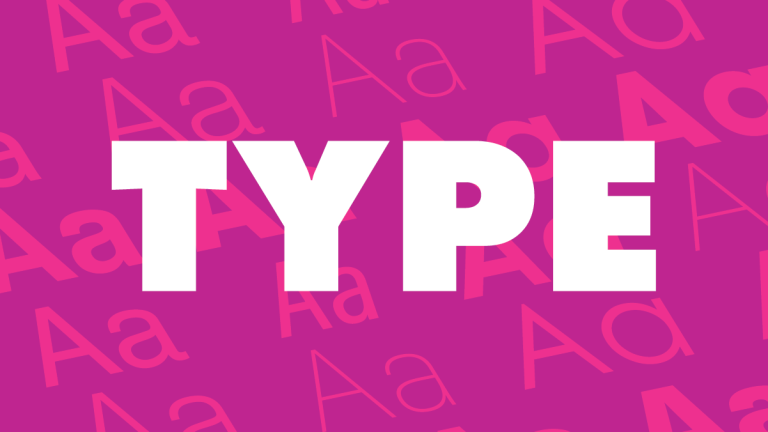
Good type is sexy! Yeah, we said it. There’s just no way around it. When we say good type, we don’t mean super crazy and outrageously unique fonts. We mean clean, modern, and legible fonts that shout expressive moods in subtle ways. Typography is a key element in everything around us. Traffic signs aren’t written in Comic Sans or Bernard MT and there are a number of reasons why that is the case.
Beautiful Type Makes You Look Good
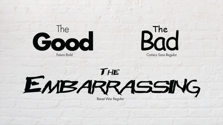
Yikes! What is even going on here? Notice how the type slowly loses its level of legibility and professionalism as your eyes pan from left to right, top to bottom. Please, always keep in mind the importance of clarity.
Typefaces are beautiful mistresses, but they can also be cruel ones if you aren’t careful with what you are using them for. When choosing a good font or typeface, always keep the message in mind. If you’re looking to have your company conveyed sense of experience, the font should match the message. On the other hand, if you are making flyers for your toddler’s birthday party; go crazy. Seriously!
We as designers can’t fault our clients for wanting extravagant and illustrative type faces that may not be the most legible. That’s just the natural instinct when you are excited about your business and can’t wait to get your name out there! But as professionals, it is our job to pull you, the end user, back to planet Earth and help you see the bigger picture. The truth of the matter is simple:
Clarity is Key
Clarity is Key